For me, drawing isn't my strongest suit, so when I found that some people do 3D concepting in zbrush rather than drawing it by hand I had to give it a try.
My Character is the Cybermancer, he is a cyborg with the ability to resurrect, manipulate the form of, and control other cyborgs, robots, the partially augmented and any other machines he wishes. His power is limited to technology. But in a world where the less man and more machine you are the more fashionable you are, he has an advantage, one that the insatiable savage within him can use to forever indulge in tormenting the minds of his prey... yeah, it's a pretty dark concept. Here is a condensed version of the high concept statement I made:
Cybermancy: Hack the Dead is a
third person melee and stealth game, you play as a cyborg with the ability to
hack other cyborg augmentations and enter their minds.
- Use brutal finishing moves on enemies based
on your ninja skills, cyber-voodoo or cybermantic hacking. Use
cyber-voodoo too psychologically and physically “break” them, suck the
data and power from their mind and body with cybermancy or drench the
ground with their blood.
- Use cybermancy to animate the dead,
they aren't effective in a fight. But the fear they instil in
your enemy’s as they claw at their feet and plea to their friends
gives you an advantage.
- Hide in the darkness whispering into the
subconscious of unsuspecting prey. Make them scared and use that
fear in your favour.
- Use cyber-voodoo to take direct control of
the weak minded, or send them enraged and berserk at their previous
ally’s.
- Combo based fighting system: reaching a high
enough hit counter allows more devastating abilities to be
used in combat.
- Stay hidden if that’s your style. Use
various dark abilities like smoke to travel short distances unnoticed. Sneak through vents or even pipes as a cloud of black smoke.
- Explore a free roam world; find optional
objectives, side quests and hidden items.
- Gain experience in necromancy, voodoo or
ninja skills to gain perk points to activate perks in each of the skills
trees.
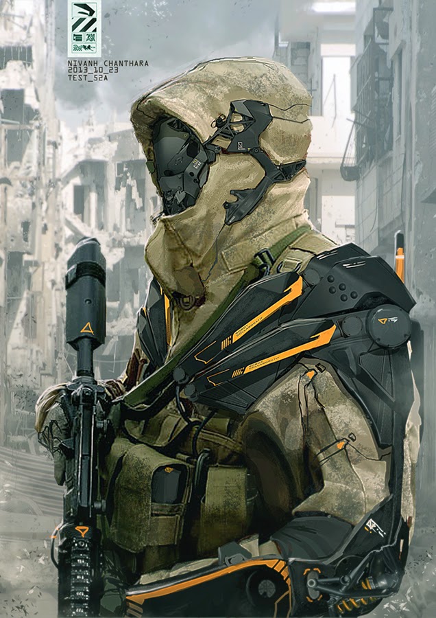
These are some of the images that informed my design decisions:
I really liked the neon lights on these and thought I could make them a part of the design of the body or cloak or maybe both.
Since my character has some voodoo powers I thought it would be cool if he had a slight tribal voodoo cultist feel, skull face paint like this could be incorporated in some way.
I like it when a cybernetic form has a strong human feel (human shape and muscle structure), But I want to make my version distinctly different from the crysis nano suit while having a similar idea behind it. So I will have to make a difference style of synthetic muscle structure and hold them together a little different. I will also add armored plates and a tattered trench coat.
The hulk was a great reference for muscle structure.
I like the more minimalistic approach for armor, it can be less practical but can also look really cool. Also the muscle structure would be incredibly strong, so armore would just make him heavier and slower.
Continuing with armor, I like genre clashes, especially Sci-fi with historical. So I thought making his armor look a bit like a knight could be cool or at least as an extra skin for the character.
I kept a hold of this because I liked the intricate detail, I wanted to do the same type of thing in focal points of my Character like the neck, hands and feet.
I decided at some pint that I wanted him to have retractable swords in his arms, a short straight style like this one would work well.
These necromancers ( and batman and conor) are great reference for hooded trench coats, something that has been in the description of my character since the beginning of his conception in my head. A bandoleer also cropped up in my head at some point.
Some general style reference, baring in mind my character should still be closer to syfy style. These pictures are actually getting a bit less relevant at this point
These are more armor references, the shoulders on the second one are somthing I might try adding back on (the lit up bits that stick up, just behind the shoulder plates plates)
Thats all the reference I used, these are screencaps of the most recent iteration of the model i'm working on:
Front
Back
Bust
Hand


