Sunday 14 December 2014

Dead Space Sniper Rifle - Post 6

Had you going there with that last post didn't I? ;P

I found the gun in my auto back folder and was able to continue as usual.
Thank thy lord and savior, Gaben is love, Gaben is life.


Sunday 7 December 2014

Demon Sculpt + quick horns tutorial

I made this yesterday, tweaked it a little this morning. I made it because I found an awesome way to make horns. It is still a work in progress though, I have not done the eyes or any proper texturing and I would like to make some armor for him.

The head is a heavily tweaked demohead tool, I will in my next creative buzz try to make a head from scratch, wish me luck on that.

If you would like to try to replicate this result, you can follow these steps below:

Draw in a "helix 3D_1" and open the "initialize" subtab in the tools tab.

In this tab, use these settings:

Use a coverage of around 1.5

Make the thickness it's highest at one end and near lowest at the other. (after doing this I advise not using the very lowest for a more realistic sharpness on the final horn).

Change the twist graph so that the first point is about 1 grid space up, leave the other point where it is. (if the groves in the final result aren't as deep as you want them, turn this up a little more.

change SDivide to the highest and LDivide to around 25.

This will give you the same sort of shape property's I had. Now just make PolyMesh3D in the top subtab of the tooltab. Then use DynaMesh at a resolution of about 32, use this low resolution for an imperfect bumpy result, now subdivide for a smooth finish.

To get the fine groves you will need to do it manually, I recommend using a brush with low intensity (about 12), smallish size (53 is about right) and an alpha like 59,60 and 61.

If these instructions are a bit to difficult to follow, let me know and I can make a video to give you more clear instructions. Or if you found it helpful, good let me know :).

Thursday 20 November 2014

Dead Space Sniper Rifle - Post 4

A friend in class helped me set up mental ray rendering, it's a rendering engine in 3ds max that makes your model look like real life on your computer screen, we didn't get it quite photo realistic yet but close enough for now. It just needs a few tweaks, a good scratched up texture and it will look great.


 side view

Ejection port lookin' fine as

 first person view, if nothing else this is a great site to behold
lens, not sure I like this as much as the last setup, the reflection is great but I want the green tint back

Saturday 15 November 2014

Dead Space Sniper Rifle - Post 3

I've been working on the model for some time now, I have almost finished the mesh but have a few thing to clean up and add, next week (Thursday) I will start unwrapping and then texturing the model.

It's so high poly, that it's going to be a ball ache to unwrap, but that's my own fault and I have to deal with it some how, I may have to cheat and use a auto unwrapping software for some parts.

note: the blurry texture is actually a noise layer, it's used for the grip to give it that rough finish. I will give components with this issue new material profiles later on.

here are some screenshots:


Thursday 9 October 2014

Dead Space Sniper Rifle - Post 2

This is the latest version of the guns design, it's not quite the last I don't think, but a considerable improvement. I changed the grips and stock entirely and added a few extras like the scope, pods on the side, the under barrel laser assault battery and what will be "the spiny thing with lights on it".

The scope is not quite finished, the bit you look into is undecided how it will look.

the pods were inspired by the weapons from district 9, they don't quite look right on the gun at the moment but I will try them on the 3D model in various places and see how it goes.

The fore grip is a tricky bit, I have an idea in my head how I want it to look but I can't do it on Illustrator. I'll keep trying to find the shapes though.

the stock is another tricky bit, It could be that this current shape will look fine in 3D because of shading and different angles, but I still don't like it very much.

I really like the rear grip, it's as perfect as I can imagine it, it only needs some kind of trigger guard to be finished.


Any feedback you can give would be very appreciated, what you like and dislike about it, don't worry about upsetting me, it may well be something I agree on but need a nudge to do something about it. like the stock, should I change it again?

Friday 3 October 2014

Dead Space Sniper Rifle - Post 1

For the first modeling project this year we had to get into groups, chose a genera we liked, then a game we like in that genera and each of us make an asset from the game (a model with texture or an animation).

I went with a Sniper Rifle. I'm not so keen on sketching unless I'm developing ideas for a shape, even then it's just a few scribes. So I did the first draft on illustrator, one of my favorite applications, here is another good example of my other work on illustrator:

http://memoryman15.deviantart.com/art/Javik-large-render-467091606


This is my first draft of the Sniper Rifle. There is allot of the design missing, for instance, I want to have more pistons on the stock for the mechanism so it looks stronger.

The bit that I started with that influenced the rest of the design was the barrel. The rib-like structure is inspired by Isaac clacks armor, from any of the dead space games.


As a sniper it doesn't sound all that innovative nor practical for a dead space game, the ammo is the real innovation. I call them daisy pop rounds. I got the name from one of the darkness II's finishers: daisy pop. I don't know if there is any other meaning of daisy pop, but the fits ether way.

The rounds are designed to open up like a flower and explode like a frag grenade before impact, making the weapon like a long range shotgun.

The technology I've thought of for how this works is that a sensor on the rifle detects how far away the enemy is and a computer calculates how long before the bullet is in optimal distance from the enemy (necromorph), this all happens constantly in anticipation of you pulling the trigger. When you pull the trigger, the computer starts counting down in microseconds, when it hits the perfect time a laser shoots the back of the bullet. This activates the first weak explosive that opens the flower, then the interior explosive reacts to the sudden air exposure and ignites the frag explosive.


Problem:  The explosive on the back of the bullet would be detonated on firing the bullet.
Solution:  An armor sabot around the back of the bullet protects the explosive and is dispelled once                      the projectile leaves the barrel of the rifle.

Wednesday 18 June 2014

Latest cover art submission

Obviously the last cover I made was just a picture I grabbed on the internet with my logo and a games for windows banner slapped over it, this one however is all my own work beside the GFW banner, pegi ratings and the steam logo. I can't pose the character yet so I just used the most interesting and ominous angle for cover, his back. there was no expression on the face so I left that to fill the back of the box where there are other things to draw attention away from the face. The "CTRL ALT DELETE" caption is something I thought of on the spot. The game is about a digital world so this phrasing works, so you don't question it. Should you though? It stands for "CTRL their actions, ALT there minds, DELETE their sanity" or somthing to that effect, I will probably change a million times.

Side note: it seems darker on the site, you might not be able to see all the detail, especially if you have a dim or poor quality monitor.

Sunday 15 June 2014

Character concept art

Having the model drawn flat like this really shows how bad the proportions are, and with the legs on it's even more evident. I will have to fix this before continuing. Bear in mind that this is a big guy with a normal size head, the problems are primarily with the shoulders and the too thin waist.
Obvious trace work is obvious.

Sunday 8 June 2014

Character concept modeling

For me, drawing isn't my strongest suit, so when I found that some people do 3D concepting in zbrush rather than drawing it by hand I had to give it a try.

My Character is the Cybermancer, he is a cyborg with the ability to resurrect, manipulate the form of, and control other cyborgs, robots, the partially augmented and any other machines he wishes. His power is limited to technology. But in a world where the less man and more machine you are the more fashionable you are, he has an advantage, one that the insatiable savage within him can use to forever indulge in tormenting the minds of his prey... yeah, it's a pretty dark concept. Here is a condensed version of the high concept statement I made:

Cybermancy: Hack the Dead is a third person melee and stealth game, you play as a cyborg with the ability to hack other cyborg augmentations and enter their minds.


  • Use brutal finishing moves on enemies based on your ninja skills, cyber-voodoo or cybermantic hacking. Use cyber-voodoo too psychologically and physically “break” them, suck the data and power from their mind and body with cybermancy or drench the ground with their blood.
  • Use cybermancy to animate the dead, they aren't effective in a fight. But the fear they instil in your enemy’s as they claw at their feet and plea to their friends gives you an advantage.
  • Hide in the darkness whispering into the subconscious of unsuspecting prey. Make them scared and use that fear in your favour.
  • Use cyber-voodoo to take direct control of the weak minded, or send them enraged and berserk at their previous ally’s.
  • Combo based fighting system: reaching a high enough hit counter allows more devastating abilities to be used in combat.
  • Stay hidden if that’s your style. Use various dark abilities like smoke to travel short distances unnoticed. Sneak through vents or even pipes as a cloud of black smoke.
  • Explore a free roam world; find optional objectives, side quests and hidden items.
  • Gain experience in necromancy, voodoo or ninja skills to gain perk points to activate perks in each of the skills trees.
These are some of the images that informed my design decisions:

I really liked the neon lights on these and thought I could make them a part of the design of the body or cloak or maybe both.


Since my character has some voodoo powers I thought it would be cool if he had a slight tribal voodoo cultist feel, skull face paint like this could be incorporated in some way.

I like it when a cybernetic form has a strong human feel (human shape and muscle structure), But I want to make my version distinctly different from the crysis nano suit while having a similar idea behind it. So I will have to make a difference style of synthetic muscle structure and hold them together a little different. I will also add armored plates and a tattered trench coat.
The hulk was a great reference for muscle structure.

I like the more minimalistic approach for armor, it can be less practical but can also look really cool. Also the muscle structure would be incredibly strong, so armore would just make him heavier and slower.

Continuing with armor, I like genre clashes, especially Sci-fi with historical. So I thought making his armor look a bit like a knight could be cool or at least as an extra skin for the character.

I kept a hold of this because I liked the intricate detail, I wanted to do the same type of thing in focal points of my Character like the neck, hands and feet.

 I decided at some pint that I wanted him to have retractable swords in his arms, a short straight style like this one would work well.

These necromancers ( and batman and conor) are great reference for hooded trench coats, something that has been in the description of my character since the beginning of his conception in my head. A bandoleer also cropped up in my head at some point.


Some general style reference, baring in mind my character should still be closer to syfy style. These pictures are actually getting a bit less relevant at this point

These are more armor references, the shoulders on the second one are somthing I might try adding back on (the lit up bits that stick up, just behind the shoulder plates plates)


Thats all the reference I used, these are screencaps of the most recent iteration of the model i'm working on:

Front
Back
Bust
 Hand

Cybermancy logo design

I've not posted anything on this blog for a long time, so I thought i'd try to get into the habit of updating it more often with the recent updates on my work. I'll start by uploading all the work i've done since my last post, this could take some time...

I'll start with the logo for a game i've been concepting for a few months. I would start with the older animation I did, but thats not finished and its for a competition so it's for my eyes only.

My game is called Cybermancy, We are thinking about a subheading but can't think of anything appropriate that doesn't sound like we pulled it from the "game subtitle bin" like "revolution" or "origins". I wanted a style that looks similar to graffiti without being totally unreadable or gastly. the style below is the reference I used.


This is a sketch I did on photoshop, it's very rough but it was fine for an idea of what I wanted to do.


This is how it looked after cleaning it up and tweaking it in illustrator.


I then took it back into photoshop and added some effects like bevel and a texture to the outline and a glowing blue fill.


I liked this but tried removing the outline and found another interesting look. This one is a bit darker with a light tint on the edge.


Part of the task was to make a concept for the cover art, I used this amazing render by Roman Makarenko as a placeholder for my own character that will be made later. (My character is still in concepting stage)

looking at it now I can see some blotchiness caused by the glow, I can address that when I put the logo on my own Character when that is done.


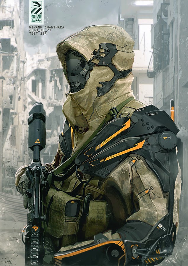
In this one the logo looks more like glass, so I should probably have added some transparency but that made it to hard to see, I like this one so I will have to work on making the logo work with the background.


I really want to make another design in orange, that is the color we decided on for the primary color scheme for the worlds technology, similar the omni-tool in mass effect. I also made a hexagon grid texture for the logo that ended up not really working out as I expected. I may try again later or  make something new. I will put the texture here anyway, for anyone who wants to use it feel free to.